Showing posts with label anatomical illustration. Show all posts

4.21.2010

Biomedical Visualization on Chicago News


So exciting! Biomedical Visualization at UIC was presented on the CBS 2 Chicago News this evening. Program Director, Scott Barrows and students Leslie White and Michaela Calhoun (with a cameo by Erin Stevens) were interviewed for the newscast. I think they did a great job showing what we do in our unique program. Props!

Furthermore, the newscasters seemed quite impressed with our unusual skill set, calling us "Renaissance men and women, like Leonardo da Vinci for this century". You can see a video of the newscast by CLICKING HERE or checking out the article HERE!

More news about our program and the people in it. Three Biomedical Visualization students, myself included, were selected as winners and finalists in UIC's 2010 "Image of Research" competition. Congrats to me, Lindsey Brake and Annie Campbell! Take a look HERE!

Hands off! to H1N1. Finalist in UIC's Image of Research. Lindsey Pionek. 2010. Adobe Illustrator, Photoshop and InDesign.

2.28.2010

Visit with a Netter


When it comes to explaining what I do in grad school, the most common response other than "Oh, so you draw guts!" is "Like Netter, right?" Instead of getting the blank stare when I elaborate (We can do A LOT more than just illustration if you haven't figured that out yet.), I usually just say yes and go on my way. This past Friday, the UIC Biomedical Visualization graduate program welcomed Frank Netter's daughter, Francine, to have a talk about her famous father. She explained to the crowd Frank's childhood and how he was interested in art, and naturally good at it, at a young age. He started out with humble beginnings and a strong influence from his mother to become a doctor, though he preferred art. They came to an agreement that he could study art at the National Academy of Design if he promised to go to medical school in the future.

After Frank's mother passed away, he gave up art to follow his mother's dream for him and went into medicine. When studying, he realized that subjects were learned much faster when drawings were made, as did his peers and professors. When he was done with school and working at Mt. Sinai hospital, the Depression came forth and health care was unfortunately too expensive for most, so few patients came in for care. To keep him from being bored, and to make money to survive, he went back to his art by creating illustrations for medicine. Like many individuals starting out in the art field, he began with low wages, but when he was able to increase his charges (even more than he was expecting as well because of a miscommunication of a series of illustrations he was going to do for a total of $1500, but client responded and agreed to $1500 for each illustration), devoted himself to create images of science.

At the beginning of his formal medical illustration career war shook the world. Instead of being drafted, Frank volunteered for the Army and was set up in a studio by the Army Medical Museum. Though bored at first, he was later contacted to redesign the Army's First Aid Manual to make user-friendly as Francine mentioned that it was a huge clunky book that did not do much help when in the field. He make the book a small size and filled it primarily with his illustrations (which by the way were painted by students at the Society of Illustrators in New York, because Frank was unable to do because that was considered manual labor which an officer of the army was unable to do). With the much-needed benefit of a hand-held reference, Frank was assigned to create more on other subjects such as survival in the arctics and tropics.

When the war was over and was done with his service, CIBA contacted Frank t0 create medical illustrations for medical pamphlets which were later comprised in a book and sold out completely for two printing sessions. With the demand from this project, Frank was asked to illustrate the entire human body in a series of atlases of the systems of the body. Though Frank estimated it would take him 10 years to complete, it ended up taking up the rest of his life. As I have realized myself, creating art always takes longer than expected.

Hearing Frank's story from his daughter was very inspiring to hear and see. His life, her life growing up being around his work, his process of work, and seeing his sketches was helpful and educational. I am very happy that I allowed time in my day to experience this talk about one of the well-known medical illustrators.

Photo courtesy of mesotheliomacg.com. Anterior view of lungs in situ. 1995. Frank Netter.

1.28.2010

Birthday Suit


Happy birthday to me! Yep, today is my 24th birthday. Though I am choosing to be alone tonight in my apartment working on homework, don't fret, I had a great day. I was surprised at work today when my fellow co-workers came in with a personalized chocolate cake with a brownie and candles glowing on top. I was so surprised and it made my day. You guys are great and the cake was fantastic too (Especially since otherwise I wouldn't have had one. Buying a cake when you live alone doesn't last long!).

Today is the only the beginning. Tomorrow will be a celebration with friends new and old around Chicago. I have a new party dress and I'm going to rock it no matter how cold it is outside. Then the rest of the weekend my family is coming to the city. My entire immediate family are coming down: Mom, Dad, my brother and my cute, precious, funny little dogs, Molly and Duke, will be here. We don't have any concrete plans yet, but I know it will be fantastic. Let the birthday celebration begin!

In honor of my birthday, above is a Photoshop-manipulated image appropriately named Birthday Suit. This image was created by photographer Mike Stowe who took a beautiful image of the female body and manipulated it to create a interesting, stunning and shocking piece of art. It is wonderful to see how powerful Photoshop can be. Though it reminds me quite a bit of Ed Gein, a serial killer who lived in the town ten mere minutes away from my hometown, the image is well done and holds my attention; what art should be.

Photo courtesy of Photo.net. Birthday Suit. Mike Stowe. 2008. Photoshop.

9.23.2009

A Little Anatomical Design Gem


Perusing the web as a procrastination tool has become vital to my sanity. However, I find some great artwork and learn a few tips, pointers and inspiration on the way so it can't be all bad, right? While working on the Frank Armitage website (which will be up soon!), I took a little breather and found this piece of creative graphic design. Loic Sattler of [LSD]Lysergid, a Berlin-based art director, illustrator and rich media designer created this Cover design for the Big Up Magazine, March 2009, issue 3. Of course, I love the use of anatomy in this piece, but all of his work is just incredible. The contrast, the colors, the geometric shapes mixed with organics, and the creativity = love, love, LOVE! Check out the rest of his work here.

Photo courtesy of www.lysergid.com. Cover design for the Big Up magazine March 2009 issue 3. Loic Sattler. 2009.

8.30.2009

Echo-echo-echo-echolocation


Echolocation is a complex process and an even more difficult one to illustrate since most of the mechanism works with air, sound waves, and nerve impulses. However, I wanted to do something with my favorite animal in a biological illustration, so I was determined. Working with my newly experimented graphic style was much easier this time so that wasn't much of an issue like last time. Another factor that made this illustration difficult was the lack of accurate bottlenose dolphin anatomy; most of my findings were schematic in nature. This was why my initially-planned first illustration became my last. I needed to do lots of research to find what I was looking for.

What do you think?

Echolocation mechanism of the bottlenose dolphin (Tursiops truncatus). Lindsey Pionek. Adobe Illustrator and Photoshop. 2009.

8.25.2009

Oh Dura!


Here is my first illustration completed for Advanced Illustration for this past and long gone summer semester. This illustration depict the dural membranes and sinuses of the skull, which are vital to take waste products and extra fluid away from the brain (sinuses) as well as helping the brain stay put (membranes). I wanted to work with my new graphic style of line and transparencies in medical illustration. Needless to say, it was more difficult than I would have expected in the way that I had to practice my restraint in creating too much detail. Plus, the view is very different angle compared to typical anatomical illustrations and photographs, so finding references was a bit of an issue too. Osirix became an essential tool for obtaining an accurate view for the illustration. In the end I am happy about the end product and I like the clean lines and subdued color palette. It is a very different style than what you see in most anatomical illustrations today.

Dural Sinuses. Lindsey Pionek. Adobe Illustrator and Photoshop. 2009.

6.19.2009

Letting it All Hang Out


The first week of our 8 week summer session is over and though I am trying to keep up with things the summer keeps on tempting me to relax, hang out, and to put it bluntly, just chill. I haven't quite stepped back into the class mode yet. It is nice in a way that our course load isn't that intense, so I still feel like I am in the clear.... I just don't want it to get out of hand, you know, since all of my weekends are already books for the entire duration. That will happen.

Though I say I have been a bum, I have:
  • Checked out artists that I admire for my advanced imaging techniques as well as choosing my scientific subjects to illustrate.
  • Taken my first Flash class and rewrote my crazy-messy notes (I swear, in the past month I forgot how to write.)
  • Gutted my room of unnecessary things that I don't want to move in less than a month.
  • Worked 16 hours and did my first tech help email and phone call. :D
  • Caught up with friends.
  • Watched Horton Hears a Who. (The animation is great and the humor is not just for kids.)
  • Worked on my online class, which thankfully has only one more week.
  • Talked with my thesis project committee chair and advisor about where I am going and what I have to do.
  • Went grocery shopping at my favorite cheap (but good) ghetto grocery store
  • Made a large amount of black bean salsa and chicken fajitas. (I missed having fresh produce.)
  • Sat and took in a wonderful summer storm.
So there, I can say I have done something with my life. One thing I'm glad I didn't do is what these little characters are up to. This anatomical imagery is from Tom Giesler, an illustrator and entrepreneur in the San Fransisco Bay area. His ties with the graphic design and medical devices industry, as well as his humor, can both be seen in these clean and simple illustrations, made to look anatomical charts. Take a look at his website as there are more anatomically-based images there!


Photo courtesy of tomgiesler.com. The spirit of sharing and Brimming with enthusiasm. Tom Giesler. 17 x 22", acrylic & digital, 2007.

5.31.2009

For the Love of the Game


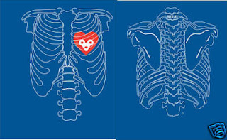
When looking for apartments this weekend in Wrigleyville and the Lincoln Park area (and stuck in traffic since there was a Cubs game) I noticed a die-hard Cubs fan wearing a shirt with this design on it. Pretty cool and I want one even though I'm not quite an intense fan of the Cubs yet.... I feel like I'm cheating on the Brewers. :D

Buy this design now on Ebay for around $20.

Photo courtesy of Ebay.com. Chicago Cubs Skeleton Shirt.

1.25.2009

Tiredness and Typography


I knew it was going to be difficult balancing an internship and classes in grad school, but I didn't think it would be this hard this fast! I usually work better under stress, but I need to transition into it. During winter break I just vegged out for the most part and enjoyed being a bum since I haven't actually had a break without a job for years. Now, assignments are already meeting their deadlines and my internship is definitely giving me enough experience! I'm only going into my 3rd week and overwhelmed. Friday was interesting; listen to this:

Friday morning I went into work at 8:30 AM since Illustration Techniques was canceled to get a few more hours in. I was already tired and was almost late because I could not sleep on Thursday night for some reason even though I was exhausted from the night and day before. I was at work until noon when I had to go to my Computer Visualization class. I had lunch during class and then at 2:30 class ended and I was off to catch the bus AGAIN to take me back to work. Got there at 3 and was expecting to stay until around 6...... it was actually more like 9! ON A FRIDAY! I definitely obtained more than 20 hours this week! Then it was off to a SAMA meeting/party (actually entirely party) in Ukranian Village. I was starving, cold, and tired when I got there, but it was a good time. We left "early" though, but it still took about 45 minutes to get home on public transportation. Phew! See what I mean? Just about every day is now like that for me, even the weekends since I have to play catch-up. I have to keep telling myself that this will pay off. :D

I worked on my assignment for my Graphic Design class and it is all about type as a compositional element. So, in honor making art out of type, I have an interesting t-shirt design with everyone's favorite font - Comic Sans. Yep, that is a heart made entirely out of letters. That had to have taken some time to create; it took me long enough to work on my own little assignment for class and I didn't create any figures out of my type! The shirt is only $22 from Veer, it may be another one worth purchasing!

Well off to attempt going to bed.....the boys are having another party upstairs so we will see how it goes... I don't think I'm supposed to take the time to sleep, it just never works out. And they are singing to Dave Matthews (hate, hate, HATE DAVE!) Grrrrr....zzzzz

Photo courtesy from veer.com Comic Sans Love t shirt.

1.22.2009

What a Fantastic Few Days!


I have to tell you, I have been busy doing things other than homework for the past 3 days and it has been awesome. My boyfriend came down on Sunday night and left this morning after dropping me off at my internship. It was so good to see him and he just makes me feel so comfortable. We can seriously do nothing and still have a blast doing it. We met some new people, seen some new places, and ate and drank some good food and drink in the Chicago area. Our relationship has had a total turn-around and though we do have some stupid little spats (mostly about his Blackberry obsession and clumsiness [he loves to dump red wine]), we make up and appreciate what we do for each other. I'm in love, that's all I have to say. He left to go back home and I didn't want him to even though school work is creeping up on me again. Meh, I did a lot before he came up so now I just have to get back on track, it's do-able. I also have a lack of sleep from staying out too late last night and then having to wake up early and work all day... it was so worth it though.

Talking about the internship.... I HAVE SO MUCH TO DO! One of our deadlines was moved up a month so instead of a month and two weeks to change things over, it has to be done in two weeks! Talk about pressure on top of school! Oh well, this too is a good experience since life as a graphic designer and illustrator is all about deadlines. Just hopefully we will make it as well as all of the other deadlines.

Since me and the boyfriend used a lot of public transportation in the past 3 days (not too many issues though for once), I wanted to find some anatomically-inspired art pertaining to the bus and train lines. Success! I found this "Follow It - Metropolitan Cardiac Authority" t-shirt on Threadless, a website that is based around t-shirt designs created and rated by the public. I love the creativity of the design as well as the wording. Too bad the designer doesn't have any description about his or herself, I would love to know more about them and their background. I'm so purchasing this shirt; it is only $15. Maybe I should submit some of my work on that site too!

Photo courtesy from Threadless.com. "Follow It" t-shirt design by j.p.

1.16.2009

MS and Art


Yay for Thursday! On Thursdays I have no class scheduled and yesterday my morning class was canceled because of the bitter cold. I wish I could have stayed in instead of freezing my tush off (negative temperatures...brr!), but it just gave me a few more hours at my internship. They kept me busy too, let me tell you. One of the projects I'm responsible for is my first brochure for the National MS Society dealing with volunteering. I'm a big fan of giving back to the community, so this project is something to look forward to! It is my first real project other than editing materials others have done, so they trust me and are giving me more responsibility. I was dying today though; coffee was not working. For some reason I couldn't fall asleep last night....so I tossed and turned in bed until 2ish. I was up this morning at 6:30. Ugh, I hope I'm not stressing myself out already!


While I was at work and tooling around National's website, up popped some medical-inspired art of the homepage! I was taken back because I wasn't expecting it. Of course, I clicked on the link and took a little break to read about Elizabeth Jameson and her art.

Elizabeth J. Jameson is a lawyer-turned-artist that started painting more frequently during her rehabilitation sessions for her progressive multiple sclerosis symptoms. Her first subjects were floral still-lifes, but eventually she wanted to paint subjects that would reflect her civil rights advocacy background. The idea of illustrating her disease came to her. The symbol of MS to her, and probably many others living with MS, is the MRI scan.

Jameson used her own MRI scans, lesions and all, to show the world what people living with MS see and go through when they are at the doctor's office. The process that she uses to transfer her own brain scans by silk or etching. Her use of color makes the MRI print stand out front-and-center. Her intention is to spur conversation by creating beautiful peices of artwork from something so menacing.

“It’s scary, it’s awful, it’s ugly — and beautiful, and intellectually fascinating, and aesthetically fascinating,” Jameson said.

To find out more about Elizabeth Jameson, go to her page on the National MS Society website, or to her portfolio website.

Photo courtesy of www.jamesonfineart.com. Jameson, Elizatbeth. Mind on Fire and Backbone

12.07.2008

Insomniac Art


It is 4:16 in the AM and I have not yet slept. I did finish my website for the most part, with a few things to fix up on it. I wanted to get it done today and after more or less 12 hours on it, it is completed. I will make sure to put it up on here when all of the tiffs are out of it. And now I'm overtired so I'm writing. This next week is going to be intense, so I better get used to lack of sleep and coffee.

I found some interesting anatomical art tonight through my insomnia. The art could give normal people the chills, but when you go through cadaver lab, you are never the same. The artist's name is Craig LaRotonda and he has a ton of surreal illustrations, with most of them dealing with something anatomical. Jennybird Alcantara has some interesting work too. (Yes, I typed that right!)

I have been checking UIC's Blackboard constantly to see if they grades are up....still nothing. You would think I would understand that and not check every hour..... I guess I will never learn. Oh well, off to bed for another day of school work!