3.28.2009

Rage

Rage:
  • fury: a feeling of intense anger
  • a state of extreme anger
  • behave violently, as if in state of a great anger
  • something that is desired intensely
  • be violent; as of fires and storms
  • violent state of the elements
  • feel intense anger


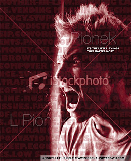
One of our graphic design assignments was based on an article about rage and our goal was to create 3 concepts drastically different from each other in any genre we wanted. The only requirements was that one image and some form of text was to be used. Here are the concepts that I came up with and I'm pretty happy with them. If you haven't heard this from me before I like simplicity, irony and the unexpected and that's what I was going for in these concepts. Simple. To the point. Eye-catching. That's what you need in an ad which I chose to work on. I found a website on anger management as well as other potential burdening factors which I thought would be appropriate and went to town.

My second concept was the favorite from my "mock clients" so I spiffed it up, but they stated that not much needed to be changed which was nice since you know, always something else to do!

At least I'm not feeling any rage right now, it has been a pretty good day. :D I'm at home in wholesome wisconsin at the moment and I have a friend from high school that is getting married tonight. Though I have seen most of the people that I graduated with in the past 5 years, it should be an interesting time to say the least.

Ad concepts based on an article about rage, Lindsey Pionek, InDesign, Photoshop and Illustrator, Spring 2009.

3.23.2009

Oh Geez....Knees


Well, I apologize for last week and not posting. It was quite the week, but now since it is Spring Break I can catch up a bit. Well this is one of the things that kept my mind busy last week. These knees kept me busy for a couple of weeks and the texturing, though it was fun, it took a long time. A lot of people opted to use already-created texture photographs, which is fine, but I preferred to actually paint the texture maps in Photoshop from scratch. Although there is always room for improvements (which I will do later), I think it is pretty good for my first shot, as well as how busy and stressful this past week was. Not only was I down in the dumps, but there were other assignments to do as well, and work on top of that. Phew! Just another day in my life I guess.

However, there was only one knee, but we had two more concepts to create: the x-ray and that cartoony ink and paint. Meh, the ink and paint was ok, but it was neat to experiment with. My personal favorite is the x-ray rendition that I created. Though another 3D max material map was used, Photoshop was used for the finishing touches. Hmm, I may be starting to like Photoshop more!


Well, that's all I have for now! Check out the knees of a couple of my classmates: Annie, Heidi & Josy.

(Also, I would love to show you my illustration of a TAP block procedure, but I was asked by the anesthesiologist that I collaborated with to wait until his scientific article was published, which will be next month! I will be published at that time as well! You will know when that occurs, trust me.)

Realistic, X-ray, and Ink n' Paint renditions of the knee, Lindsey Pionek, 3Ds Max and Photoshop, Spring 2009.

3.17.2009

Time and Love


Time cures everything.

Time gives you more experience, gives you the opportunity to learn, the ability to finish projects (this week is full of them), and the potential to heal a broken heart. All of these things I am experiencing right now and as I was looking through stock images for my ad comps for tomorrow, this one popped up on dreamstime.com. Soon I will have the TIME to write more often when TIME slows down a bit and I can get some much needed R&R at home during Spring Break next week.

Reality has been blowing this week, but this too will soon pass.

3.12.2009

The Basics


Here's my brochure that I created in my graphic design class. I chose Crohn's disease because I have a friend with it and I wanted to know more about it. She has to watch what she eats now because certain ingredients can make symptoms flare up in which she is unable to live life normally. I learned a lot about the subject and you can too now!

I have created brochures before in Undergrad and at my internship, so I enjoyed working on this one since I was able to be a little more creative. Here are the reasons for the design
elements chosen:

  • The simplicity of the brochure reflects "The Basics" of Crohn's disease.
  • The graphics reflect that Crohn's is an intestinal disease.
  • The stimulating yellow used signifies happiness and hopefullness with living with Crohn's, but can also mean to be too stimulated reflecting the irritation of the intestines
    during flare-up.

So there you go, learn something and let me know what you think!

Crohn's Disease 'The Basics' brochure design for people or family members diagnosed with Crohn's. Lindsey Pionek, 2009.

3.11.2009

Let Me Free


I thought this ad was appropriate for how I feel today. Needless to say, this week has not been fun: I'm not working well on my assignments (or I'm being a perfectionist) and the boy is just not working out. Not. One. Bit. Therefore, I'm a little upset and just want to go to bed and not really write tonight. So here's another anatomy-based ad since we were talking about creating an ad in Graphic Design today as well as that the brain wanting to get out and stop thinking (like my own at the moment).

This ad is actually created for the Mexican contemporary art museum, Museo Tamayo de Arte Contemporáneo in Mexico City. I don't quite understand the relevance, but I think it was well done, creative, and definitely memorable, that's for sure! The agency that created this piece is Draftfcb-Mexico headquarters. Draftfcb has a few headquarters around the world and have an impressive client list... take a look!

Ok, off to bed, hopefully a better (and more productive) day tomorrow.

Photo courtesy of AdPharm.com Print advertisement for Museo Tamayo, 2009

3.08.2009

Protect Those Pearly Whites

If I had sensitive teeth and saw this ad, it would probably influence me into looking the the product the next time I was looking for toothpaste. This ad for sensodyne was created by the Callegari Berville Grey Agency in Paris, France under the creative and art direction of Andrea Stillacci and Gregory Renault respectively. I like the fact that the ad is simple with great contrast and using the anatomy in a creative and clever way. If an ad make me giggle a little, is memorable, and gives me inspiration to create, it is a good one in my eyes.

Plus it never hurts to take a look at what established ad agencies are putting out into the world.

Ok, time to crank out some illustrations on a rainy Sunday.

Photo courtesy of Adoftheworld.com "Sensodyne Hard Hats", Callegari Berville Grey Agency

It's Official


I am now a student member of AMI, the Association of Medical Illustrators. It's a big deal now in my head: I am an official student going through the process of being a certified medical illustrator. They provide you with this packet of stuff that is rather interesting to look at and helpful as well. It's still hard to believe I'm going through all of this; it is just flying by and I am learning so much.

I also kinda figured out what I am going to do for my thesis project, but I need to discuss the topic with professors to see if I'm getting ahead of myself or if it is time and complexity-appropriate. We will see soon enough! You will know about that when I formulate the subject more!

Today was quite a day which was full of equations with image resolution, display resolution, pixels, and all of that fun printing stuff. I felt a little silly because at first I could not for the life of me figure out how to calculate these equations. It has been so long since I have had to think about equations other than really basic math, but after walking away and thinking that I am idiot, it clicked. Phew, good thing because I thought I was losing it. I was also working on my graphic design projects and had to go and print a comp of my brochure (yay, more printing!) I felt a lot more confident going to Kinko's than I did in undergrad since I have had more experience and I knew what I was talking about instead of leaving it all in the employee's hands. Also, the guy was really nice and gave me my prints for free! I don't know why, but I won't complain. Now I just had to bring them back to my apartment through walking through the pouring rain, then on the El, and on a bus. Surprisingly, it all worked out with public transportation and the elements and I was able to get the prints home ink-running and crease-free! For that, I treated myself with Thai delivery. One of my roommates suggested Yummy Thai, located on Taylor street, and I'm glad she did... so good and cheap! I will be ordering from them again!

Photo courtesy of AMI.org AMI Medical Illustrator Source Book Cover

3.06.2009

MRI and CT Scans Galore!


Phew, what a week! My boyfriend was down at the beginning of the week and recently I have been catching up on assignments so I apologize for not writing as religiously as I should be... he tends to be a distraction at times. ;)

Anyway, the field of Biomedical Visualization is obviously all about accuracy. Therefore, it is best to have a reference to look at when you are creating medical art. However, that is not as easy as setting up a still life unless you want the smell of phenol and/or rotting flesh (gross, but the truth). Therefore, we have to improvise and use what we have learned as well as other sources. Though anatomy references are essential, there can be errors as well as limited views of the subject at hand. This is where CT and MRI scan databases come in.

Both MRI and CT scans are noninvasive medical procedures that are created in the way of taking small "slices" of x-ray imagery and stacking them. In this fashion, the image data set can be compiled to create a 3D image. CT scans create more detailed images, but carry a risk for the viable patient: radiation. Because of this, CT scans are limited to the number of times a living human can have this procedure performed. In contrast, MRI scans are much safer, but provide less detail.

Both of these are medical procedures, but are valuable to medical illustrators as well. We can create 3D images (such as our next Computer Applications assignment in which we will be creating 3D knee models from scanning data sets) as well as using the numerous cross-sections to use as reference in 2D illustrations. All-in-all, you can tell that it is very useful in the field of medical visualization and illustration. I have used OSIRIX and will be using MIMICS and I'm only in my first year of the program! (Note: the data sets that are utilized in these programs follow standard IRB and HIPAA protocol with patient confidentiality and names have been removed.)


Other people, such as the UK-based artist presented in this post, utilizes medical scans in a more artistic and free manner. Angela Palmer uses MRI technology to create some fascinating and memorable artwork. She works from her own MRI scans as well as others and etches the cross sections on glass and aligns them to create 3D images. She has also done some work in multimedia by creating video. Though not a science-based artist, she strives to create awareness through her art which is educational in itself. Take a look at Angela's portfolio site to see some more medical scan-based artwork!


Photo and video courtesy of angelaspalmer.com "Self Portrait", Angela Palmer; artnet.com "Self Portrait 4", Angela Palmer; and youtube.com "MRI Scan Art Video", Angela Palmer

3.01.2009

Mac vs PC and Design

Yet another video of how simplicity is overlooked in the design process by some. Why mess with a beautiful thing?

Give them what they want, but try to prevent them from going to the dark side of clutter.

That's all you can do.

The Life of a Designer.... at times


This is how it is sometimes. I wish I didn't look this video up again; I keep rewinding it back in my head. Ha ha! I just better get used to the design process I guess. It is a little over the top, but there are some very true factors in it. Trust me, I have been there!

Video courtesy of YouTube.com